Design can be a weapon for social change
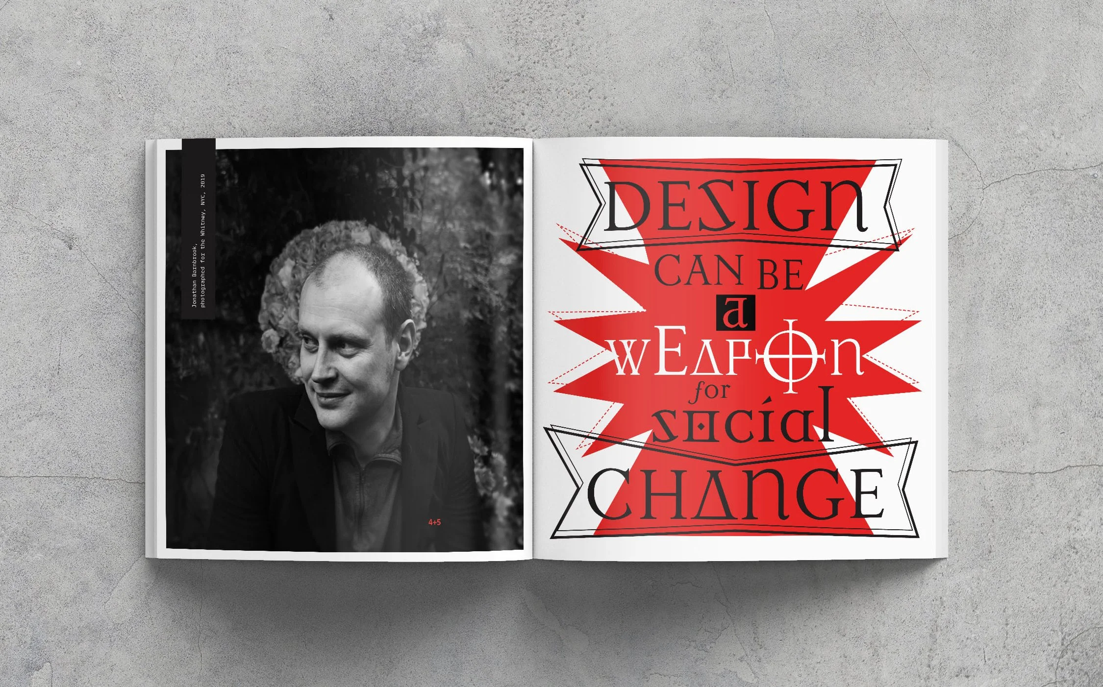
Jonathan Barnbrook is about as punk rock as you can get as a type designer. He’s best known for his work with David Bowie, and his massive presence in the Occupy movement in the 2000’s.

For this (fictional) show, I took a deep dive into the design process of Barnbrook. Organized chaos, incredibly detailed type work, and unapologetically anti-government. For the book, I wanted to highlight pieces of his work, while embracing his design aesthetic through the messages he conveys. I played with type placement, unconventional layouts, and even added in some easter eggs, just as he tends to do.

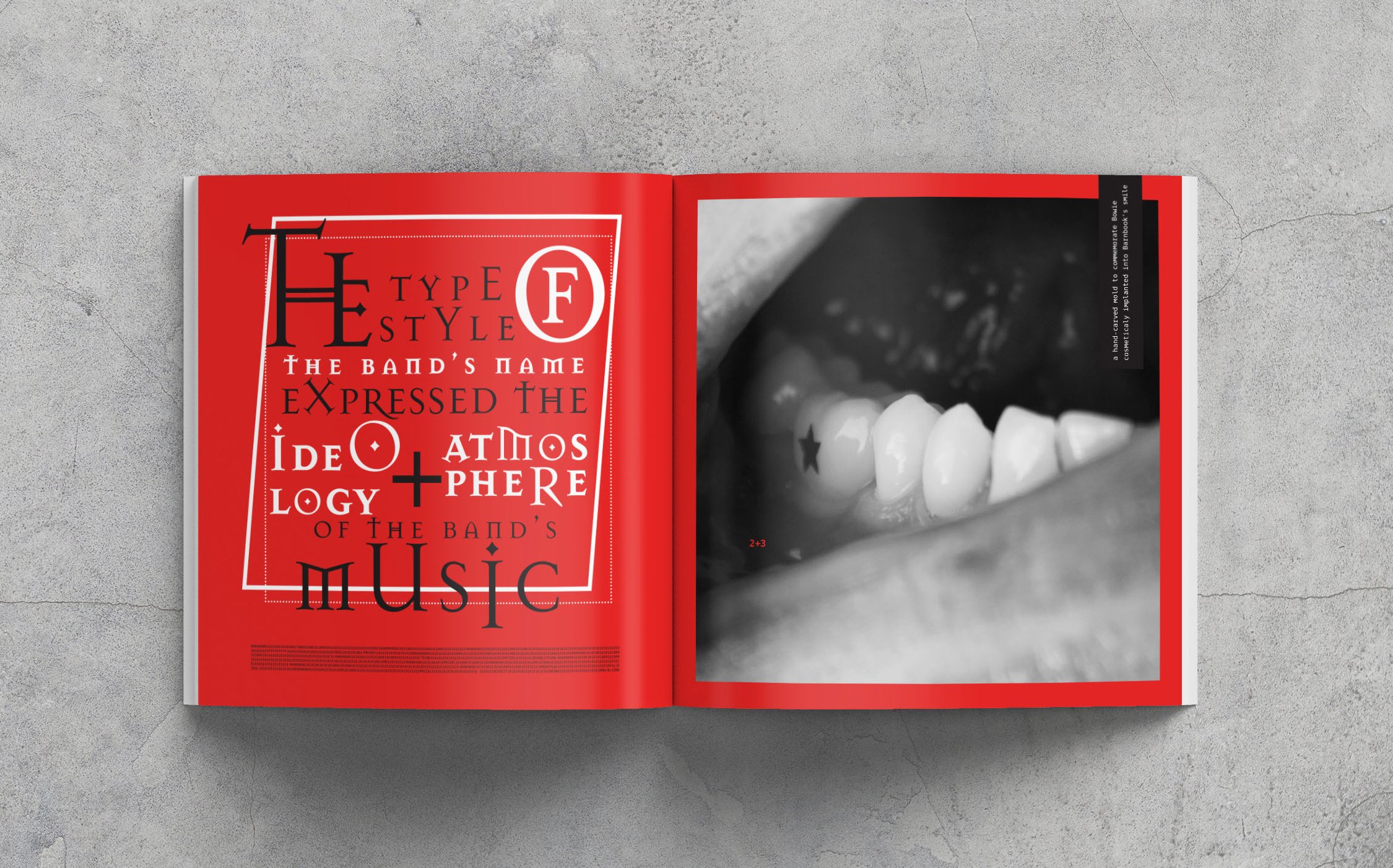


The book was designed in a square layout as an ode to his work with record (or more commonly at the time, CD) covers. The diecut glyph is from Exocet, one of his more well known typefaces. The pattern on the front and back cover is a pattern hidden in another set of his glyphs. With the book comes a square “Disobedient” sticker, which calls back to his work on the Bowie album The Next Day, when teaser stickers in the same style were placed all over fashion ads in London.

And of course, what kind of punk rock show would this be without pins?
